When done well, artfully expressing chiaroscuro gives the eyes lots to see in both the brightest parts of the image as well as in the darkest. The sense of depth can be profoundly interesting in such images. I like to say “Light without shadows is nothing, because shadows are where the secrets hide.” I enjoy getting lost in the shadows. Do you?
You might want to know first that Wiki says about chiaroscuro “..in art, is the use of strong contrasts between light and dark, usually bold contrasts affecting a whole composition.” The images below are classical chiaroscuro. Chiaroscuro is an old fashion style of art, dating from the 1700s masters of portrait, still life, and genre painters like Caravaggio and Rembrandt. But it’s popularity has never gone away. Thomas Cole, Thomas Moran, and Albert Bierstadt, painters from the Hudson Valley School (1800s) extended the chiaroscuro style to landscapes. There are many contemporary painters and photographers who continue to make images in the chiaroscuro style, including me.
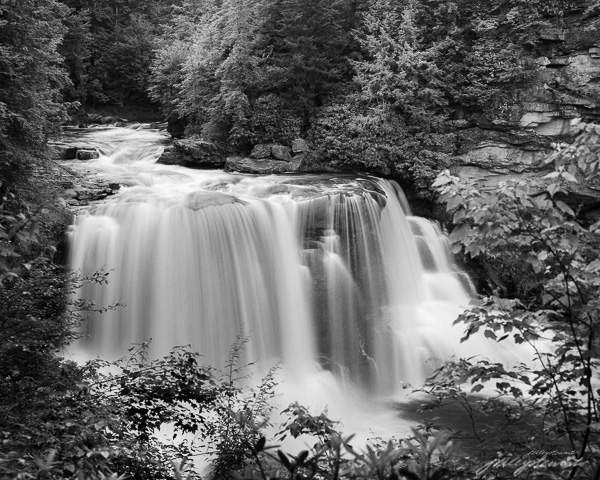
The only reason I’m even talking about chiaroscuro is because I absolutely love this style of imagery, and I think you probably do too since you’re reading this newsletter. After all, the strong use of shadows and light is a consistent feature in my own photographs, as in “Foot of the Fall” above.
In my implementation of chiaroscuro, I like to follow what I see in the old masters’ paintings. There’s always lots of delicate highlights, which are made more compelling by lots of delicate, revealing shadows. Note I didn’t say featureless whites and sooty, blank blacks. To me, featuring huge paper white spaces or pure black spaces is the farthest thing from true chiaroscuro.
When done well in photography, chiaroscuro should almost seem like the highlights are dancing with the shadows. One moves into the space of the other without stepping on toes or losing the natural rhythm. Neither is dominant; they are in perfect balance. And very difficult to achieve, even when I find natural compositions that might lend themselves to this treatment.
But I’ll keep looking for those that do.
Do you like this style of imagery? Do your eyes lock to one end of the light range over the other (highlights or shadows)? Or do they flick back and forth in search of secrets?
Until next time,
Jim
Did you enjoy this edition of Friday Foto? Feel free to share this article with someone you think might also enjoy it, and invite them to subscribe to “Under the Darkcloth.” And please leave me a comment or ask a question by replying to this email.
Copyright J. Riley Stewart, 2018, all rights reserved.
The first question we ask of an image is about context.
Have you ever wondered why you are drawn to certain images? I mean images you can’t take your eyes off of. Images that literally drag you in and stimulate you to recall precious stories from your own memory. The short answer is context, because in imagery, context matters.
The use of context in artful imagery is a huge factor in whether you may actually appreciate a given image (or not). Understanding this one aspect of imagery could lead you to collect art that you will love forever. It may also keep you from buying something that winds up in the attic after a few short years (…&*#@% !…).
The best way to explain why context is so important is to know that context is tightly linked to our own personal memories. Without a memory (or recognition) of a certain subject, your brain decides that it’s abstract and immediately switches to a more complex analytical pathway to make any sense of it.
The more difficult the recognition, the more the brain has to analyze and conceptualize. It can be quite intimidating while the brain interprets the puzzle. And an image with no context is a puzzle, for sure.
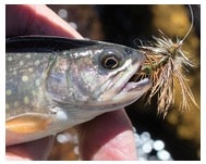
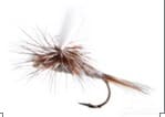
For example, if you’ve never seen a fishing fly, you have no way to describe this “thing.” That tuft of feathers on a curvy thingy may be quite confusing to you. But show you that same fly in the mouth of a fish, and it becomes more clear what it is and what it’s supposed to do.
You now have the context necessary to discern the purpose of the fly, and your brain doesn’t have to analyze it as much. (You now know what my favorite hobby is!)
Even though confused by abstractions, our brains are extremely capable of conceptualizing and letting us imagine what that abstraction could be. In fact, some of us love puzzles. We prefer abstract art forms and shapes precisely because it stimulates our brains to conceptualize. It can be exciting to imagine something in a highly abstract painting or photograph that isn’t really there.
I recently had an amusing discussion with a gallery visitor about what she saw in a highly abstract painting hanging on the wall. She swore she saw a horse; pointing out its nose, and mane, and back. Of course, I didn’t see her horse, no matter how hard I tried. Her brain was working hard to make something appear out of an abstraction that she could recognize, and that was great fun for her!
Personally, I like some context in the images I make, such as a log cabin in the woods, or a beautiful sunrise over a quiet river, or even a landscape vista during the peak of Autumn. These are subjects that push the brain to recall peaceful, nostalgic feelings and conjure stories from my own memory (and yours). I think realistic, context-rich art pulls on the heart while abstract art pulls on the brain. And I’d rather have my images pull on the heart.
The featured image “Stones of Any Shape” is a slight departure from my normal style because of its abstraction. I’m using it here as an example of how context matters. There’s not much context here, is there? Just stones arranged in an interesting pattern. The image says nothing about how, where, or why the stones are arranged this way. Is it a road or walkway? A fence? A wall? How large are the stones? What color are they?
Don’t worry, though. Your brain will conceptualize whatever you want to see. And that’s completely okay.
Is it necessary to know those things to enjoy the image? Usually not. You can love a picture without context, it just means your brain has to pre-process it somehow before getting to the “love” part. The other side of this pre-processing situation can also lead to rejection if the context can’t be imagined readily. I have another article you may be interested in that explains the role of mystery in images to either compel a sense of “boring,” “interesting,” or “bizarre”… check it out here.
And when context doesn’t provide the answers we want, we can always let our brains conceptualize the answers that makes the most sense to us, and just have fun with it.
As you look at images online or in a gallery, ask yourself about their context. Is the context obvious or elusive? Starting with that one simple question can often lead to many more questions, and in the process you may learn something about yourself and strengthen your appreciation of art.
If you’d like to read more about how our brains interpret visual abstractions, I’d recommend this article from Salon.
_______________
I first published this article in my newsletter “Under the Darkcloth” on May 26, 2017. To get these articles sent to you personally, just subscribe HERE.
________________
Until next week, please share this email with others who you think might enjoy it.
J.
As I look back on the past 3 months of winter, by some definitions I haven’t done much. I’m ashamed to say it, but I’ve been a couch potato for much of this winter, watching TV and reading….and lots of thinking about my artwork. And making decisions.
For some months, I’ve been questioning what the heck I’m doing taking my camera out in the woods and capturing scenes to print and sell (hopefully). Sure, I’m happy doing that, but am I really contributing anything important with my artwork? What difference is my artwork making to anyone? I’ll probably never know the answer to that question, but at least I’m asking it. It comes from a healthy dose of self doubt.
This winter I read “Courage to Create” by Rollo May. This book heightened my sense of what it can mean to be “creative.” May’s thesis is that all profound changes in humanity down through the ages began with feelings that arose from art, and that it was the responsibility– no, the duty–of artists to create art that changes humanity profoundly. He sets an extremely high bar for anyone who considers themselves to be a creative soul: to “change the world.”
I wish I could change the world for the better, but I’m not sure I have that much courage. I can be more creative in my photography, however, and perhaps begin to address that nagging concern about my art’s worth in the world.
The photographer Minor White once said “One should not only photograph things for what they are, but for what else they are.” Maybe that’s what I’m after….how best to reveal the “what else” in my chosen subjects.
Revealing the “what else” requires a creative mind. Photographing the “what else” requires watching a subject closely for a time–even over several days–to get to know it, to give it time to tell us something we didn’t know before. Isn’t that what a photograph is supposed to do? I think so.
The amount of time I’ve spent thinking and reading over the past several months about being more creative I hope will have long lasting impacts on my work as an art photographer. I hope you see those changes, and I hope you begin seeing more of the “what else,” not only in my photographs, but whenever you see an image that strikes you. I hope you begin asking “what else” does the image mean? Once we start asking ourselves such questions, we’ll begin engaging in photographs more deeply, and enjoying them more, and maybe even changing what we think about the things photographs represent. Perhaps even developing a fervor for the subject that will eventually “change the world.” Who knows?
Other News:
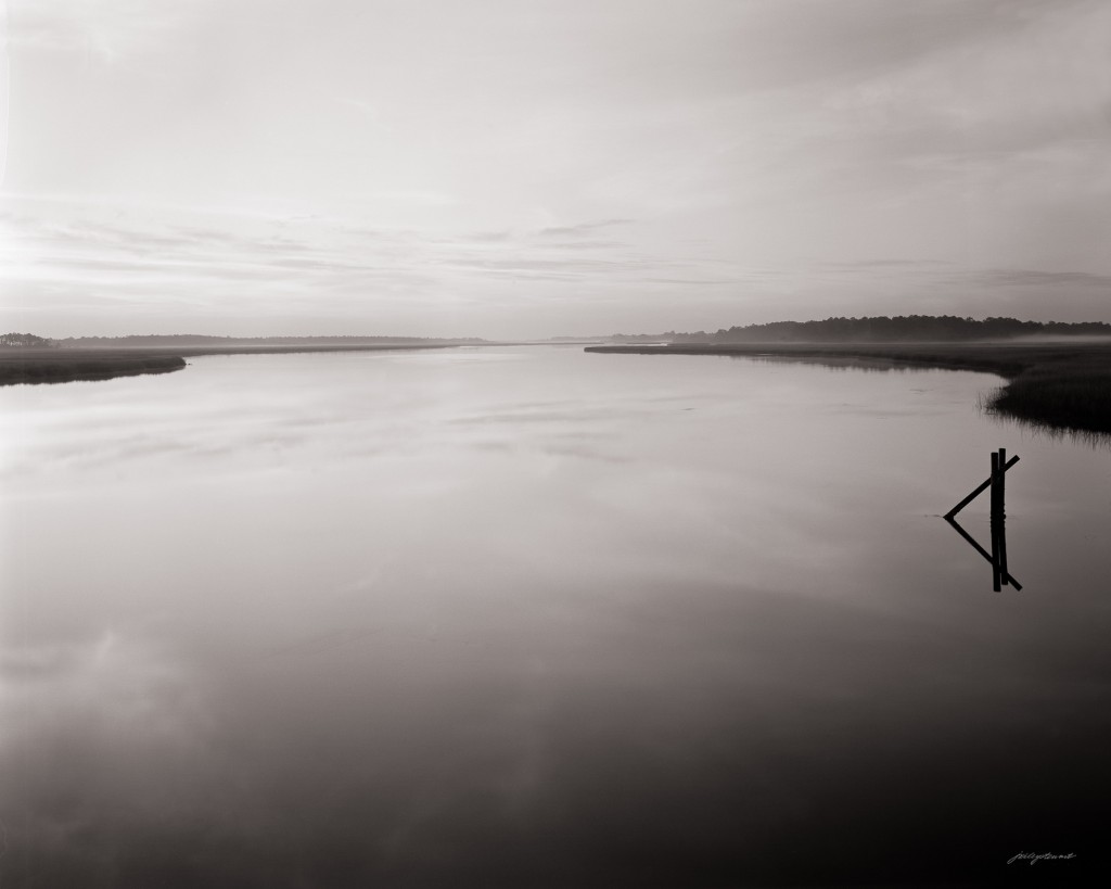
I just returned from another week in the romantic Carolina Lowcountry. I love that area of the country. I spent every night camping out of my new Ford Transit van equipped with a cot and sleeping bag, and surrounding by all four of my camera bags, tripods, film gear, and food. That way, I was able to go wherever I wanted, whenever I wanted. I thrive at being spontaneous (some would say impulsive). I’ve developed all the film, scanned them, and am in the process of expressing the subjects the way I do. The header image “Sunrise at Wimbee Creek” is one of the first from the new series.
There’s still 12 days to visit my “Virginia Grist” exhibition at the George Washington University Ashburn, VA campus. Click the link to get details.
Have a wonderful Spring!
Jim
P.S. If you think like-minded friends and family would enjoy seeing and hearing about the news I’ve shared with you, ask others to subscribe to my newsletter. I promise, subscribing won’t cost them a dime.
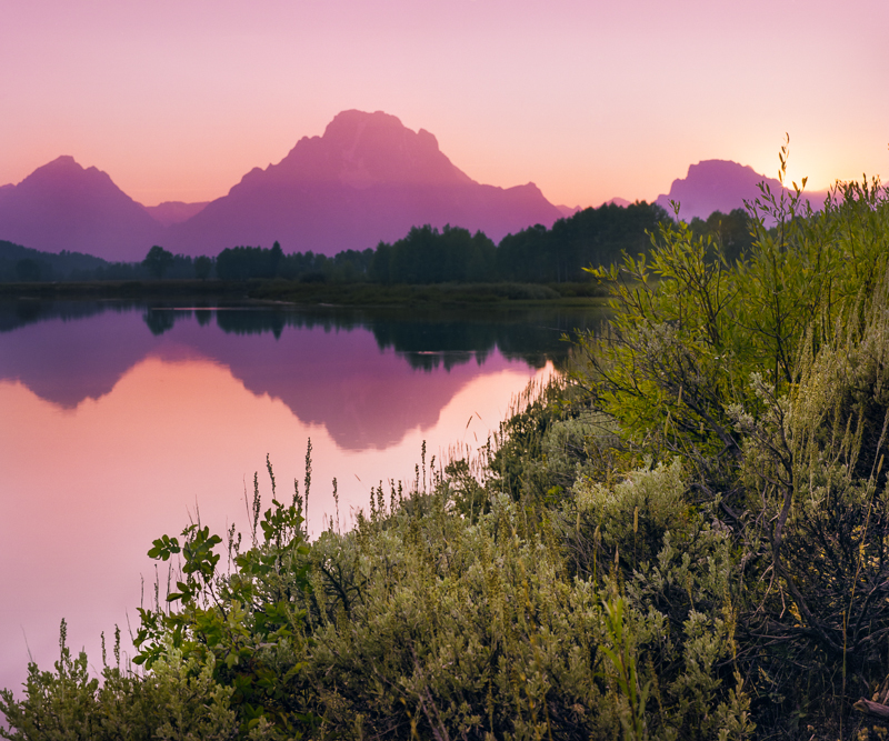
“Purple Mountains Majesty” …..The sun does magical things in the mountains.
I want to talk about something that, in the broad scope of all we are dealing with in our modern culture, isn’t that important. But still, whenever we see bias raise it’s ugly head, shouldn’t we speak up?
The bias I’m referring to is that held by art snobs (or are they?) who have yet to accept that a photograph can be a form of art. I truly believe these folks are the exception and not the rule, but in my own little sphere of creating photographs intended as art, I see this bias far too often. So I say “Time to get real, folks.”
As Kathleen Brussard at the Art Institute of Chicago says in the related link (below): ““It’s an interesting moment. Earlier generations were struggling to have photography taken seriously. We’re way past that now.”
In its most visible form, the bias against photography as an art form takes shape in the exclusion of the medium of photography in art shows. Here’s a recent example from one of the most popular art shows in the northern Virginia area:
“..The following mediums are accepted:PAINTING – DRAWING – SCULPTURE ETCHING – WOODWORKING – GLASS. We cannot accept fiber arts, photography, furniture, and crafts at this time due to space limitations.”
Clearly the sponsors of this popular show consider photography to be in the same category as “crafts” and “furniture.” And “space limitations” is just another way of saying “your medium is not important enough to devote any wall space to it.”
My other pet peeve is when I see distinctions being made between “artists” and “photographers,” like “We accept artists and photographers,” or “we exhibit art and photography.” Really?? I get the feeling that those who make such distinctions really don’t respect photography as an art medium, but they have to include it in their agenda (whatever that happens to be), and thus add photography reluctantly, and separately. It would be different if they said “painters, watercolorists, illustrators, and photographers,” but they don’t, they say “artists and photographers.” That’s like saying “cooks and pastry bakers,” or “musicians and clarinet players.”
For the most part, and most clearly in what I call the sophisticated art world, photography as an expressive art form is unquestioned today. But getting this acceptance did not come automatically.
Almost as soon as photography was invented in the early 1800s, the debate began whether the rather mechanical process of making photographs could be considered an art form or not. At that time, the question was “could” a photograph be expressive (i.e., artful). That question had to be answered first. After all, most paintings aren’t considered art either. But the question of whether painting could be expressive was never under debate; clearly it “could be.” Acceptance of this new fangled invention called photography as an expressive art form required evolution, and time.
While many early photographers took the path of straight portraiture and documentary photography, others took the path of creating pictures of highly expressive subjects, Notable among them were Julia Margaret Cameron and Henry Peach Robinson. These early pictorial photographers purposely created images specifically to gain acceptance in the European art world. The pictorial photographers were successful, and by the late 1800s, art exhibitions and galleries began including photographic prints in their art exhibits, lending credence to the claim that photographs could, in fact, be expressive art. So, the question “could photography be an expressive art form?” was really laid to rest over 100 years ago.
Aside from its many uses to merely document the human experience through the decades since photography began, it is clear that photography today is an accepted art medium. Photography has kept pace with, and in some cases led, breakaway art movements throughout the 20th Century. Today almost any well-known and respected museum has sections dedicated solely to photographic art; and there are a number of museums and galleries dedicated specifically to art photography. Photography has stood its ground in the art world for decades, and it’s time for the 21st Century art snobs to realize that fact.
So, why is there a residual bias against photography as an art medium. To be categorically excluded from an art show merely because my chosen medium relies on a camera is akin to a painter being excluded because they use a pallet knife instead of brushes. That almost never happens in general Calls for Art (“Oh, we’re sorry, we only accept paintings on linen”), and it shouldn’t happen to photographers. Camera-based art can be every bit as expressive as any painting or illustration. And that’s an opinion shared by the most sophisticated art galleries and museums on the planet.
One reason why art snobs today might be reluctant to accept photography as an art form is the same reason given in 1888. In that year, Kodak introduced its consumer-grade camera that put photography in the hands of every man, woman, and child who could click a shutter. If everyone can do it (i.e., take a photograph), then it can’t be art, right?
Well, we can just as appropriately say that giving a brush to someone doesn’t make them a painter, either. The tool doesn’t create the art, the artist does.
I know that the state of photography today, with billions of digital images being shared on the internet by every Tom, Dick, and Harriet, can easily give an artful person cause to ask the question about photography as an art form. Personally, I find that 99.9% of the photographic images I see day in and day out are far from what I would describe as “expressive.” So we have to ask the right question, don’t we? CAN making a picture yield something that is expressive? The answer is definetly yes, but, like most paintings, most photographs are far from being expressive and artful.
The art world in general is well beyond asking if photographs can be expressive; clearly they can be. Any measure one uses to judge acceptance of photography by art collectors proves this. Photographs often sell in the millions of dollars and in my experience, galleries and art shows in which photographs are allowed compete very well with oils, watercolors, or any illustrative artworks.
Instead of excluding the medium of photography from art shows and instead of making false distinctions between “artists” and “photographers,” it’s time for art snobs to give the medium of photography the respect it deserves. Let the artistic talents of one who uses a camera stand on his/her own merits, just as you allow those who pick up a brush or pen.
We know that art moves us emotionally. That’s its only purpose, really. But why do some of us respond to a piece of art in a positive way (“I love it!!), while others respond to the same artwork in a negative way (“….yuk…”)? Is it the artwork that makes us respond so differently, or is it something in us? The short answer is “yes.”
Let’s start with a story. Two boys are standing at a busy intersection with cars and busses zooming by. One of them stands at the curb edge, toes literally hanging over the curb, relishing the rush of turbulence as the vehicles pass. The other is ten steps back from the curb, subconsciously placing hands over his eyes, anxious and afraid to move an inch, eagerly waiting for the traffic light to demand that the chaos cease.
Such it is in life: some of us relish stress/adventure; some of us hate it and will avoid it at all costs. Most of us fall somewhere in the middle of the range, but it’s safe to say that most of us treat excessive stress as something we’d rather avoid than embrace. It’s not healthy to be stressed out all the time.
I worked in the healthcare industry for over 40 years, so I have a fair sense for the misery of disease and the ecstasy of healing. For years I’ve been intrigued by the research into the effects of art therapy (the act of making art) and art intervention (the act of viewing art) to speed recovery in patients suffering from a wide range of temporary illnesses and severe stress.
The beginnings of modern art-related healthcare goes back to Florence Nightingale, who is credited with the movement that led to placing artwork in hospitals as a way to improve healing. Nightingale wrote in her 1860 Notes for Nursing that “the beneficial effects of art was not only on the mind, but on the body as well.” Her beliefs have since been proven time and again in a number of scientific studies.
One consequence of those studies is something we see every day in our modern hospitals and medical clinics. What do you remember about your last visit to the doctor’s office? Do you remember the color of the walls and carpet, or do you remember the abundance of art on the walls? Most likely, it’s the art you remember.
We decorate our hospitals and clinics with art for a reason. Research shows that art improves not only mental but also physical well-being. It reduces length of hospital stays, reduces the need for certain medications like painkillers, reduces blood pressure, improves patients’ satisfaction with their treatment, and reduces the cost of healthcare. Being sick is very stressful, and art helps reduce the stress, which restores health.
Not all art is beneficial in reducing stress, however. Research has shown that some art reduces stress while other art actually enhances stress.
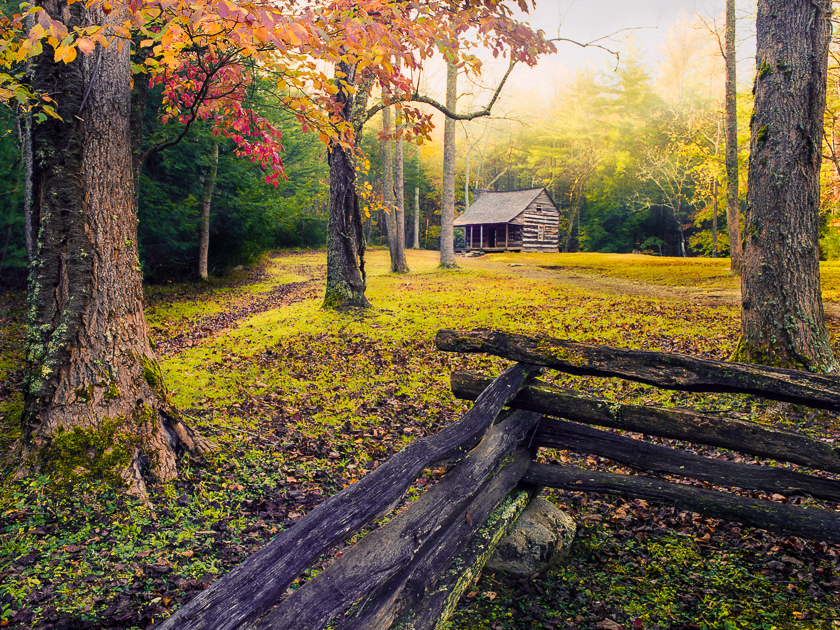
Different art styles and subjects generally evoke different feelings. A 2003 medical study by Ulrich and Gilpin showed that art having easily recognizable subjects (i.e., representational art) from nature tended to restore health in patients faster. Restorative art subjects include calm or slowly moving water, verdant foliage, flowers, landscapes having foreground openness, warming park-like scenes having sparse trees and grassy undercover, nonthreatening animals like birds and pastorals, and natural scenes having nostalgic cultural artifacts.
“Carter Shields Cabin” by J. Riley Stewart. A nostalgic homestead at the edge of a verdant forest and bathed in warming light.
Restorative subjects may appeal to those of us who are more like the kid standing well away from the busy curb, or who want to use art to create a space having calming, stress-free influences.
Just as some art calms and restores us, there are other styles of art that does just the opposite. Healthcare research suggests that patients exposed to non-representational images and images having negative icons responded negatively to treatment. Specifically, art that is ambiguous, surreal, or abstract tends to evoke strongly negative emotions in people already experiencing stress. Such art is more open to personal interpretation, and people who are already stressed tend to interpret the art as harmful, not helpful, to their states of health and mood.
Certain iconic shapes, forms, and tones can evoke fear, apprehension, and suspicion even if highly representational and realistic. For instance, images containing visual negative icons like dark, razor-sharp or jagged edges, or subjects that represent dangerous situations such as rapidly moving water, or fire, or cold icy scenes are often interpreted as ominous and even hair raising.
People whose nature it is to be more like the boy with his toes hanging over the edge of the curb, or those wishing to raise the level of excitement and tension in their favorite space might prefer artwork that is more abstract or visually ominous in style.
“Blackwater Falls at Full Force” by J. Riley Stewart. Abstract scenes having torrential waters, deep shadows, and a heavy sense of gravity can evoke a sense of adventure and excitement.
As a final point, researchers claim that people very often react to the same art differently depending on their current mood or underlying nature. We can expect stressed or stress-averse people to respond very positively to restorative, calming styles of art and negatively to abstract and visually ominous art. Expect people who are on a perpetual buzz and full of excitement to respond more positively to abstract art and visually ominous images.
So, are our responses to art due to the art itself or is it due to something in us? The answer is yes, it is both. Art is the original “interactive media,” and we should expect our responses to a certain style of art to change as our moods and natures change.
What we now know about art and how it affects our moods provides a compelling reason to consider how art might affect us in our own living and working spaces, doesn’t it? How do you feel about the art you have displayed in your favorite space? Does it calm you when you’re stressed? Does it bore you when you need a bit of excitement? Or is it just right? If not, perhaps you’ve changed.
Have a comment about this article or want to share your own experiences? Please leave a note below!
I’ll leave you with this reference if you’d like to read more about art in healthcare: https://www.healthdesign.org/chd/research/guide-evidence-based-art
A visit to the National Gallery of Art in Washington DC yesterday inspired me to write about something that guides my own journey as an art photographer, and it comes from my favorite fine art painters.
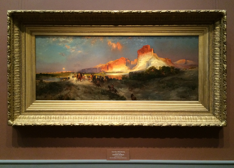
Green River Cliffs, Wyoming by Thomas Moran
I’ve always had a powerful wonder-lust for the romantic, luminous landscape paintings from the 19th Century. While the romantics were busy at work in Europe, the luminism movement was underway by the Americans at the Hudson River School. Even as a kid, I remember being thoroughly captivated when looking at picture books of paintings by the luminists like Church, Moran, Bierstadt, and Durand: it was my secret pastime. http://en.wikipedia.org/wiki/Luminism_%28American_art_style%29
Luminism refers to the dramatic portrayal of natural bright light in a scene, particularly in landscapes and seascapes, where it appears as if God created a huge spotlight to illuminate the subjects. Reflective surfaces like rivers, oceans, and pools often played a significant role in luminist’s paintings, as if to help scatter the light across the canvas.
Just as important is the luminist’s use of shadows. It’s the very quality of vast, open shadows that I really love and appreciate in works of the luminist style. Their shadows are full of life and details that draw me in to explore what’s going on–to be curious–and I’m never disappointed.
But It’s the interrelationship between shadows and brilliant lighting that create the overall emotional effects one gets from the art of the luminists. The luminists were masters in creating a sense of luminosity. Luminosity gives us hope in the knowing; it enlightens us. Dark shadows are sublime; making us wary and uncertain. Without the substantial areas of shadow, the intrigue and mystery would be lost, and without the brilliant lighting, the luminosity would fall apart. The interplay between the two are critically important to creating such strong emotions associated with the art of the luminists and romanticists.
In my own photography, I’m always looking for situations that remind me of the luminists. One of the main reasons I still use film to capture my images is because only film retains shadow details and textures at exposures that also retain delicate details in the highlights. As with luminist’s paintings, having in my photographs something to explore in both the shadows and well-lit subjects is important to my creating the feeling of luminosity and intrique, something that I find personally rewarding.
Happy collecting!
Jim
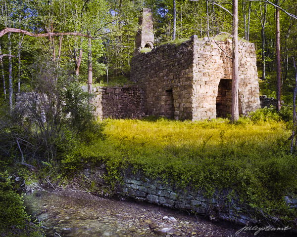
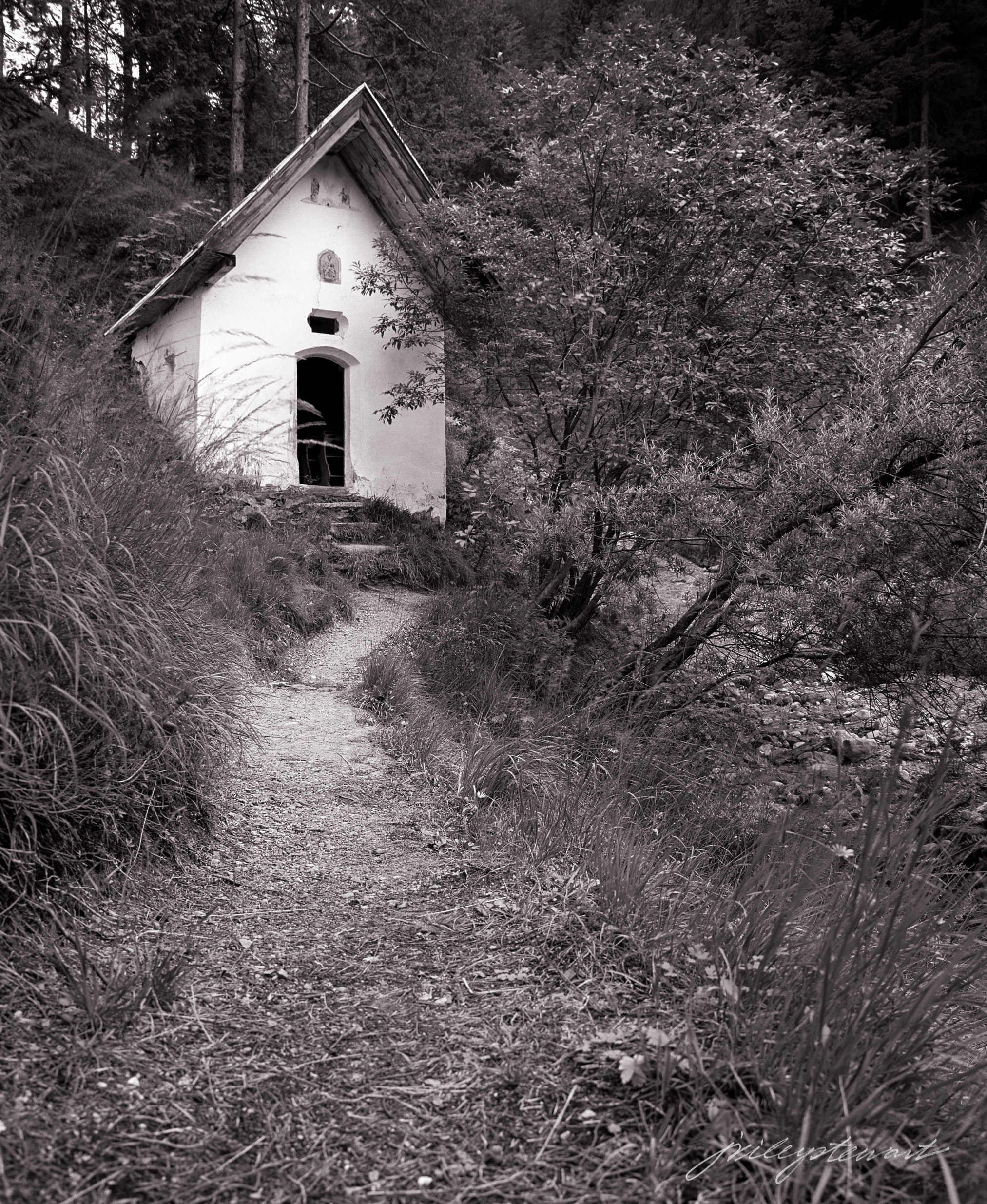
Purple Mountains Majesty, copyright J Riley Stewart“One Morning at Liberty Furnace” copyright J. Riley StewartPath to the Chapel, copyright J Riley Stewart
Note: The National Gallery of Art is an easy walk from the Archives metro station in Washington D.C. The Gallery is a national treasure not to be missed if you’re in the area. Admission is free. Open most days 10 am – 5 pm. There you will find one of the largest collections of paintings by artists of the Hudson River School. Besides thousands of other exhibits, they have a marvelous art book store.
“…is that Photoshopped?” : One of the most commonly asked questions to photographers
To some people, it seems to matter how much enhancement (i.e., “photoshopping”) I do to my photographs. I thought I’d share my opinion on the topic of “photoshopping.”
The question itself is unique to photography. No one would ever consider asking a painter if their artwork reflected the true nature of the scene they painted, so why ask a photographer? What’s different about photography (more about that in a future article)?
In truth, I really don’t think it matters to most people who ask this question, I really don’t. I think most ask it out of interest only, or just to keep the conversation going. No matter how I answer this question, I believe the experience of seeing the image would be exactly the same: They either love it or they don’t.
Enhancement of photographs means different things to different people. Documentary publications like National Geographic set strict guidelines with which they expect their photographers to obey regarding photo-manipulation, or ‘photoshopping.’ On the other hand, images created solely for artistic purposes have no such limitations: Art photographers follow the ambiguous rule of ‘artistic license.’
“You don’t take a great photograph, you make it” Ansel Adams
I’m not a documentary photographer, and that’s the first thing I tell people who ask if I enhance my photographs. But I do believe the NatGeo guidelines are pretty sound. Going excessively beyond basic cropping or adjusting lighting and colors soon becomes ‘digital art’ and not photography. But that’s just my opinion; others have no such qualms about compositing several images together, or using filters and overlays to create their ‘photographs.’ That’s okay. It’s artistic license. But it’s not okay when we expect a photograph to be a documentation of something that happened, such as in photojournalism, when nothing could be further from the truth. You get my point, hopefully.
I personally believe my job as an artist is to create imagery that makes you want to engage in the scene, to feel something at an emotional level (e.g., nostalgia, introspection, fascination, awe, etc) and perhaps even step into the scene and do the types of things you like to do, such as explore, learn, or just chill out. To create an emotion, at the very least, visual art must have heart.
My camera, on the other hand, is entirely uncaring of your needs: it has no heart; no capacity to record emotion.
The hardest part of my job as an artist, then, is to translate what the camera records into a scene having the life and emotions that I felt at the time I took the picture. This nearly always means that I must enhance my images; or said another way, I must ‘fix’ them; I must put the heart back into them.
In my personal artwork, I try to limit enhancements to the point where I’ve corrected for my camera’s failings; to re-instill the emotions I felt at the time I took the picture. After all, if I dislike overly-enhanced photographs, I don’t think you will either, and I will have done a very poor job as an artist.
The truth is there are plenty of fantastically interesting subjects in our world that, if we have our eyes and hearts open to the experience, and happen to be there at the right time, would make a great photograph (or painting) even without much enhancement.
My featured photograph this month “Purple Mountains Majesty” is a good example. I had been standing in this spot for about an hour waiting for this exact second, not really knowing what I was waiting for. When the moment arrived, I absolutely loved how the warmth of the setting sun cast a glow over the upper mountains and reflected into the dead-calm river below. The mountain shadows and their reflections were a deep beautiful purple invoking an intense sense of comfort and peace. But it was a color my camera and film seemed to dismiss as unimportant. My camera failed to recognize how beautiful the color transitions in the sky were, going from exciting warmth near the sun to that calming lavender farther away.
When I interpreted this particular scene, I found that I had to bring back (i.e., “enhance”) the color and emotion I felt at the time, and yes, I did that using photoshop. As is usual for me, I removed nothing and I added nothing of a physical nature; I merely put the life back into the scene. After all, that’s my job!
Try to not to get hung up by an art photographer’s use of ‘photoshopping.’ Remember that cameras never come with a heart, so the artist must make up for that failing. If you must ask an artist if they “photoshop.” that’s okay, too. You’re not alone!
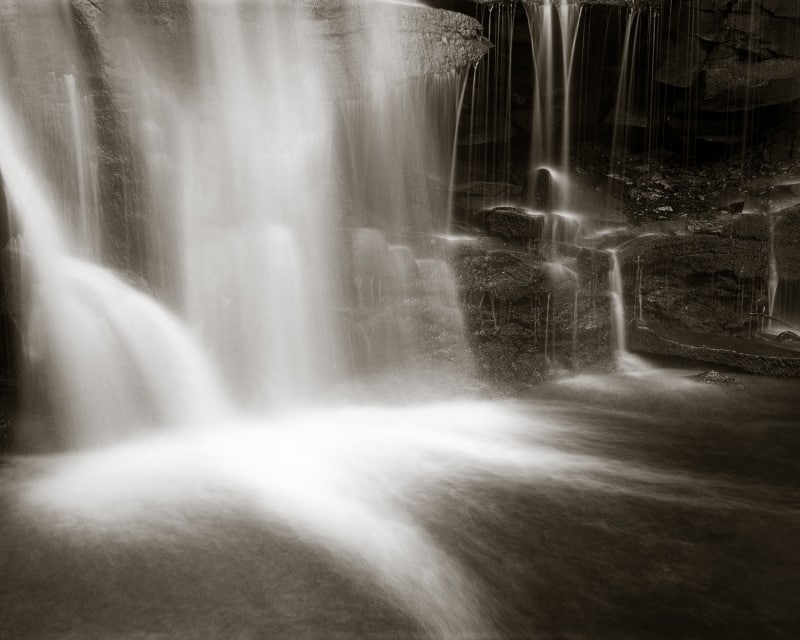
 Chiaroscuro is an old fashion style of art, dating from the 1700s masters of portrait, still life, and genre painters like Caravaggio and Rembrandt. But it’s popularity has never gone away. Thomas Cole, Thomas Moran, and Albert Bierstadt, painters from the Hudson Valley School (1800s) extended the chiaroscuro style to landscapes. There are many contemporary painters and photographers who continue to make images in the chiaroscuro style, including me.


 Did you enjoy this edition of Friday Foto? Feel free to share this article with someone you think might also enjoy it, and invite them to subscribe to “Under the Darkcloth.” And please leave me a comment or ask a question by replying to this email.
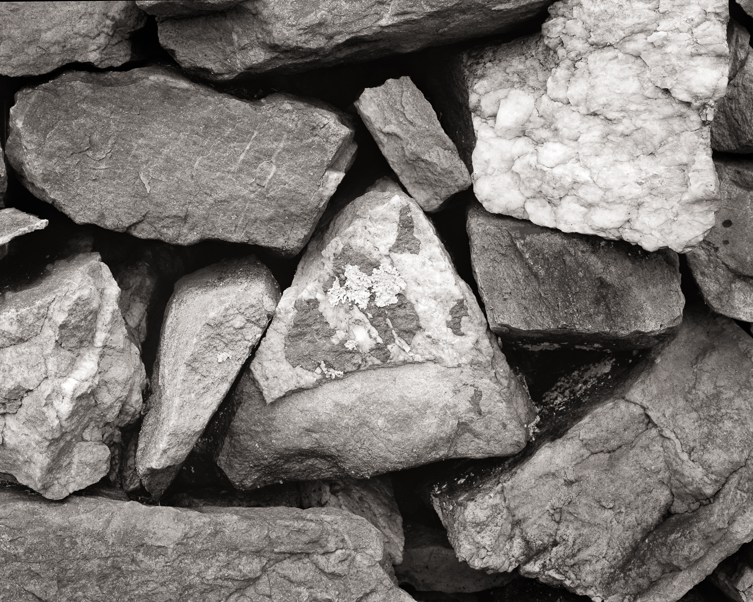
 For example, if you’ve never seen a fishing fly, you have no way to describe this “thing.” That tuft of feathers on a curvy thingy may be quite confusing to you. But show you that same fly in the mouth of a fish, and it becomes more clear what it is and what it’s supposed to do.